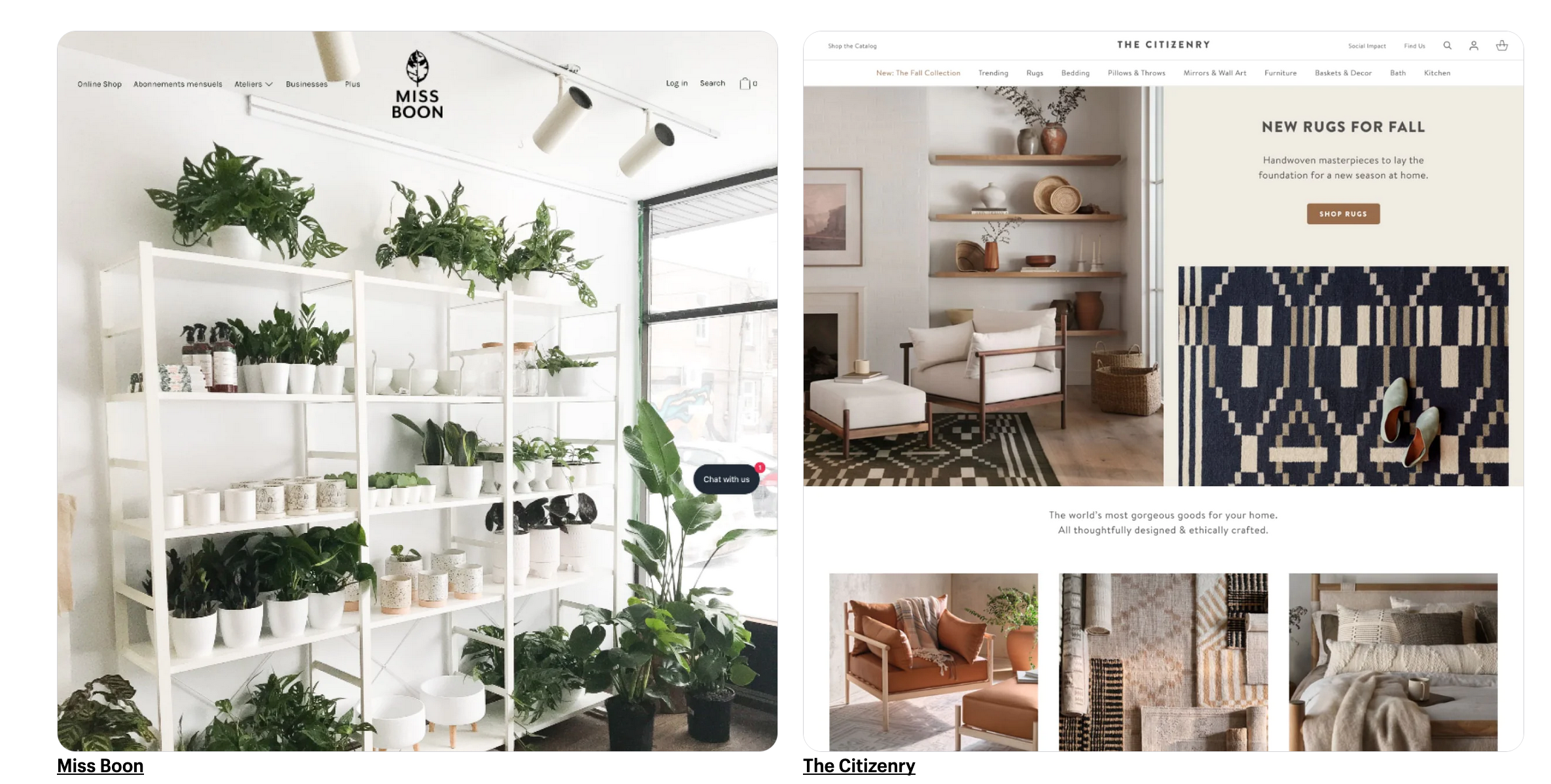
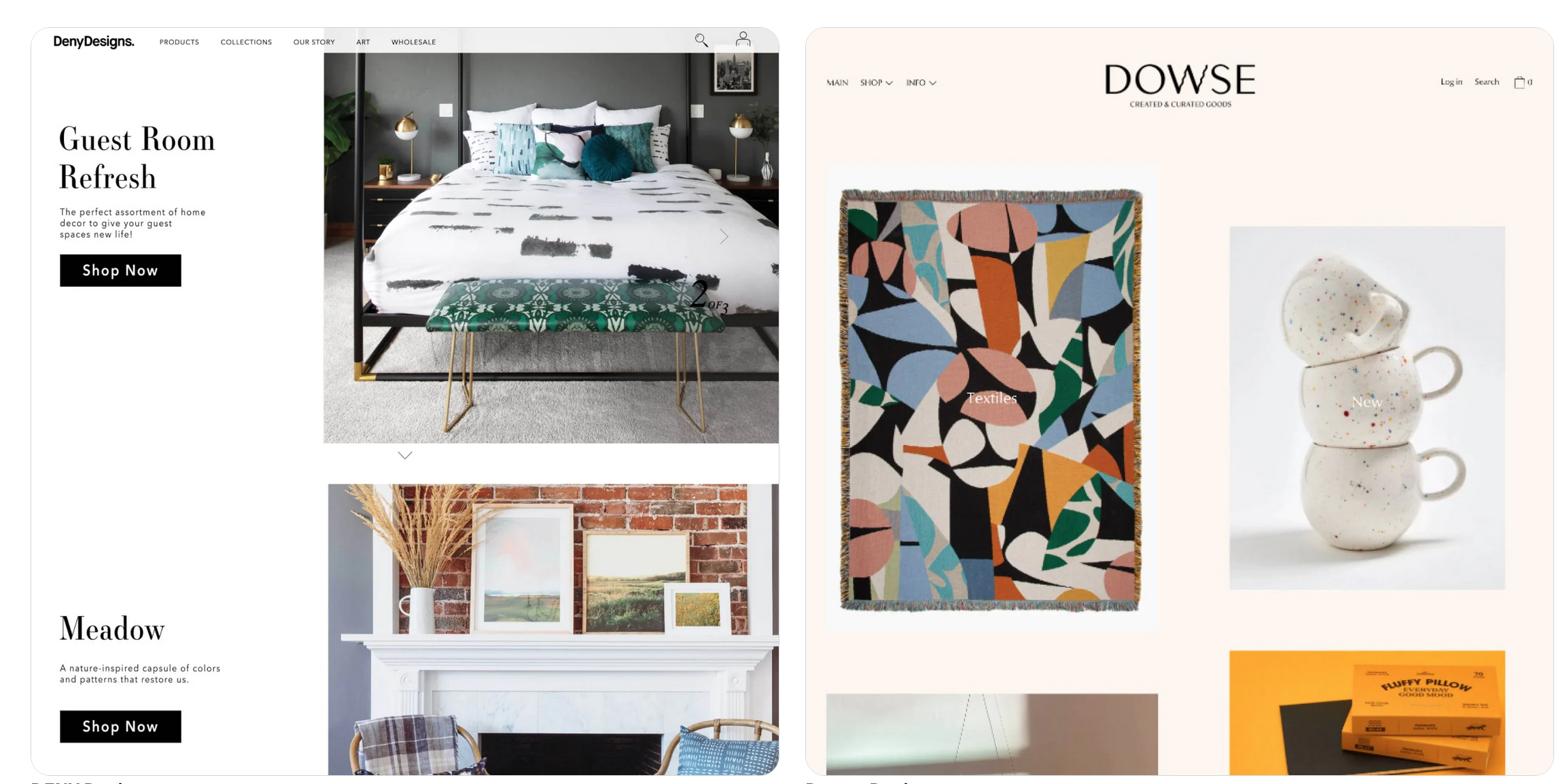
There are a multitude of ecommerce platforms: however Shopify stands many notches above the rest given its popular user friendly, robust, highly customisable and secure online store builder.
How your Shopify store looks as well as its functionality are critical for the success of your ecommerce venture.
The functionality as well as look and feel is crucial for attracting customers, keeping them engaged in your front store as well as driving sales.
The Way Your Shopify Storefront Looks and Functions Matters

While Shopify has in place all the tools and features to create a professional and visually appealing front store: as a Shop owner you need to know what a typically well done Shopify store should look like. This guide is aimed at comprehensively answering the question: What Does A Shopify Store Look Like?
The guide will explore different aspects of a professional Shopify store including the storefront look and feel (layout), branding and customisation, formatting the product pages (for layout and SEO), mobile friendliness and overall user experience (UX).
The guide will also outline why and how Shopify is a great ecommerce platform choice for beginners based on its intuitive and user friendly online store creator interface.
What Should a Shopify Store Have?
A Shopify store is not just a web of interlinked pages and product listings. A well-designed Shopify store is a conversion driving machine which offers an immersive online shopping experience to customers.
When building your storefront on Shopify, the aim must be to articulate a design and user experience that 1) Captivate visitors and 2) Converts them into paying customers 3) Retains them as loyal repeat customers. To achieve this, make sure you that your Shopify store has these critical elements outlined below:
Striking and Appealing Visuals
Having high quality and striking visuals on your Shopify store is non-negotiable if you want to achieve a high end user experience.
To achieve this you need to make sure you use high resolution and professionally designed graphics for your branding (logo and look and feel), as well as (and more so) for your product listings.
Product Listings
Maintain a consistent branding across your front store and social media pages. The logo, typography (fonts) and colour schemed must be coherent and consistent.
Make use of eye-catching banners for your page headers: particularly the home page. Make use of these to also highlight promotions, seasonal campaigns or new arrivals.
How users move around your front store and access different site pages as well as product pages is crucial.
To ensure a user friendly navigation, you must organise your products into logically browsable and searchable catalogues within the main menu.
Make use of a drop down menu (or mega menu) if your theme allows, to simplify access to product categories and subcategories.
Implement a functional and visible search bar to enable your customers to find products easily through either typing keywords, SKUs or product names.
Place clear calls to action (CTA) on each product listing to encourage users to take the desired action. Make use of CTAs such as “Buy Now” or “Add to Cart”, “Checkout”, etc.
Detailed Product Pages
Your product pages must be detailed. They should have descriptive and comprehensive product titles that articulate the essence of the product.
The descriptions must also be compelling and accurate. Employ persuasive language in crafting product descriptions. Make sure your descriptions underscore key product features, benefits and solutions.
Display prices and discounts clearly with each product listing. Avoiding having hidden costs by ensuring that you display additional costs and shipping fees.
Share Your Story
To strike a deep connection with your customers (community) you need to share the story of your brand with the customers. Add this to the “About Us” page where you also spell out the mission and values of your business. This goes a long way in creating an emotional connection with your customers.
A Shopify store should also have features for personalised shopping experience. Consider implementing features like personalised product recommendations and personalised shopping suggestions based on customer user patterns and behaviour.
Mobile Responsiveness
Mobile commerce is a big thing now. The segment of shoppers doing transactions on their mobile devices is currently worth $400 billion in the US alone and the number is expected to grow by more than 1.5 over the next two years.
As such, your Shopify store should be mobile responsive. Choose a theme with a layout, fonts and buttons – as well as navigation that are optimised for mobile (smartphones and tablets).
Smooth User Experience (UX)

Also ensure your Shopify store loads fast to reduce bounce rates and improve SEO rankings. Make sure your checkout is also streamlined in such a way that minimizes the rate of cart abandonment.
What is Bounce Rate?
Bounce rate refers to the number of people that leave your site due to the low site load speed. It also refers to the short lived duration of users on your website (online store or boutique) who leave because your page is taking too long to load. A high bounce rate affects your rankings negatively.
Trust Signals
Social proofing is a critical part of ecommerce. A good number of prospective customers coming to your website don’t know you personally and your brand is new to them.
Including trust signals such as badges, secure payment options as well as customer reviews is a great way to inspire confidence in them that your brand is credible.
Customer Support
Your customers and prospective customers must feel that they can reach out and get help from your business as and when they need it.
You need to publish clear contact details where your customers can reach you. This is typically your telephone/mobile number, email address, or live chat support.
It’s also helpful to include an FAQ page on your customer support page to answer common questions proactively.
Blog Integration
You can integrate a blog to your Shopify blog for the purposes of content marketing. In such a case, your blog drives your content media funnel strategy that aims to generate traction and traffic and convert cold leads to warm leads and finally warm leads to converted (paying) customers).
Adding all these elements outlined above to your blog is a great way of giving authority to your Shopify front store. Customers expect an online store to be credible, secure, user friendly, mobile friendly and visually appealing.
Is Shopify Good for Beginners?

There are many top brands in ecommerce including, BigCommerce, WooCommerce, Wix, SquareSpace, Sellfy, Ecwid, Volusion etc. In the section below I outline the main reasons why Shopify is hailed as one of the best ecommerce website builders overall – and why the ecommerce website maker is good for beginners.
User Friendly Interface
Shopify has a powerful online store builder. The intuitive drag and drop interface makes it easy for beginners to create their stores in the backend.
The interface makes it easy for online beginners without any technical coding or design skills to build professional and visually appealing front stores.
Shopify free and paid themes also produce user-friendly front stores that make it easy for customers to interact with the front stores, browse and search for products – and complete purchases.
Shopify Pricing Plans and Packages
Shopify is also affordable. The platform has a free plan where beginners can test the waters and learn the ropes of ecommerce without any financial risk. Shopify premium plans start from as low as $25 paid monthly and these come with a 14 day trial to enable online shop owners to test the platform risk free.
N.B. remember to check the Shopify website for the latest (updated) prices and plans.
Overall, Shopify has a user-friendly setup, solid hosting and security services, a vast app marketplace for extending the features and functions of your online store, over 100 payment gateway options, 24/7 customer support (email, live chat and telephone). Also Shopify online stores are scalable.
This means that you do not need to commit to high tier plans upfront when starting out. The platform grows with your business so you only pay for the features you need.
With Shopify you would not switch ecommerce platforms, the platform is suited for micro ecommerce ventures as well as big enterprise level ecommerce businesses.
Final Thoughts
As you have observed, to the question: What Does A Shopify Store Look Like? The short answer is that a Shopify store requires a number of elements to be functional as well as to look convincing and professional. Design and functionality are critical to achieve a solid user online shopping experience. Security is also non-negotiable especially when it comes to ecommerce, particularly on the online payments aspect.
Shopify has all the features and functions to meet all these requirements and more, you just need to be intentional about following best practices and paying attention to detail to build an online store that attracts customers and inspires trust to ultimately drive conversions.
Here is to wishing you all the best in your ecommerce endeavour.

